We are an independent and collaborative creative boutique based in Seoul. We are specializing in brand identity, creative direction and digital design, and work with diverse range of brands, services and partners.


SMILING TOGETHER WITH JANDI
The vision of the brand is to provide a pleasant and positive working environment by improving productivity and convenience with JANDI, the Smart Walking Platform. The new symbol consists of two alphabet J, smiling in one direction facing each other and expressed a face smiling together. The new visual identity captures the experience of creating personalized satisfaction, growing relationships and smiling together in a successful project through collaborations in an enjoyable and vibrant atmosphere.


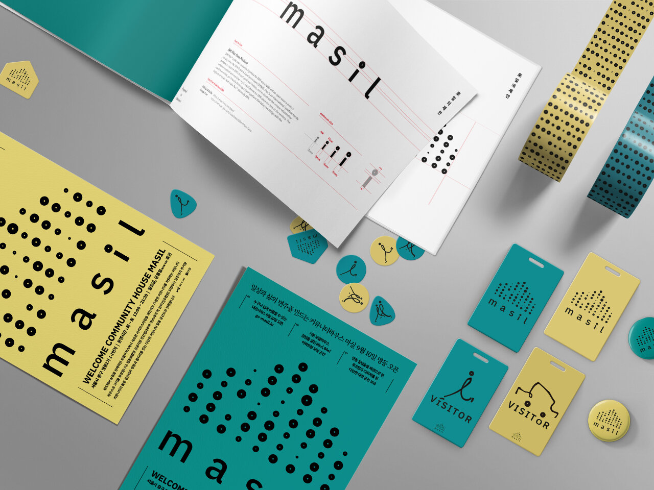
COMMUNITY HOUSE, MASIL
Community House Masil is a tenant recruitment base for WESTAY, a private rental housing business. But Masil is also used as a space for member community activities and citizens to meet, even after a person has found a home. In Korean, Masil is an old word for town. The term invokes the notion of people meeting in one house of the village to talk about their concerns, have fun and share food. The Masil Community House's visual identity takes it cue from this story. The designers created various circular motifs that symbolize interaction, representing how people's thoughts and energies bring life to a city.


FOR THE INITIATOR OF THIS AGE
<The Initiative> is a contents publisher with a focus on publishing with the mission of challenging a better future.
As globalization and technological innovation take place every day, the world is changing so fast. They are preparing a book that reads the world ahead of time rather than adapting to the passage of time. You can see four letters 'i' inside the word ‘initiative’. It looks like 4 persons are standing. Let's express the letter 'i' which is located at the front as a more progressive and proactive character. After converting the first ‘i’ to italic, the remaining three letters 'i' follow him. He looks like an initiator.